
Landing Page Design
Landing page design that matches what your ad promised
Landing page design for paid campaigns starts with message match: each page repeats what the ad promised and asks for one action. Everything else supports that or goes.
Proposed change
ExampleHomepage headline
- Loads fast on phones
- Clear call button
- Quote form works
- Easy to read
In every planIncluded in Local or Growth, from $149 a month. Every plan has every feature; they differ by size.
Compare plansWhere ad spend is wasted
When the landing page does not match the ad
Paid clicks are the most expensive traffic you will buy. Yet they often land on a page that makes the visitor start again.
- The ad is specific and the page is general.
- The ad said "commercial roof repair, 24-hour callout". The page opens with a company introduction and a photo of the office. Now the visitor has to work out whether you do the job they clicked on. Many go back and click the next ad, and you pay for both clicks.
- Every ad sends people to the homepage.
- A homepage is built for every visitor and every reason for visiting, which makes it the worst place to send someone with one specific need. Its menus invite browsing, the last thing you want from traffic you just paid for.
- The page reads like a brochure.
- Company history, values, a team section and four service categories. All fine on a website. On a campaign page, each one competes with the single action you are paying for, and every extra link is another way to lose someone.
- The form asks for more than the offer is worth.
- Eleven required fields, a budget dropdown and a required phone number, for someone who wanted a quote by email. People weigh these trades quickly; if the ask feels too big for what they get, they close the tab.
- Nobody can change the page.
- The page was built as a finished product and every edit needs a developer. Six weeks later the campaign has changed and the page has not. The testing it was built for never starts.
Message match
Why message match matters most on a landing page
Someone who clicks an ad makes a quick check: is this what I clicked on, and do these people do it for someone like me? They decide in a second or two, mostly from the headline and the line under it. Only those who pass that check read on.
Message match means the page carries on where the ad left off: not the same words, but the same promise with the same detail. If the ad said same-day, the page says same-day near the top. If the ad named a city, so does the page. If the ad quoted a price, the page shows it and does not hide it behind a form.
This is why one landing page for a whole campaign rarely works. Two ad groups that promise different things need different pages, or one sends people to a page that answers someone else’s question.
Message match goes beyond the headline. The proof should relate to that service, the images should show that kind of work, and the form should ask about that job. A page that matches in the headline and drifts off-topic by the third section has only delayed the mismatch.
Before you brief a page
Does this campaign need a page of its own?
You need one page for each different promise, which is often fewer than one per ad group. Sometimes the best destination is a service page you already have. Three questions settle it before anyone designs anything.
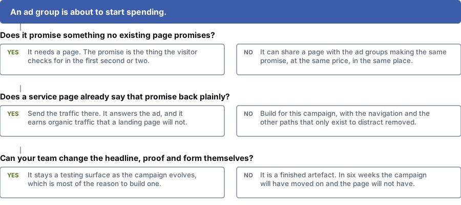
Does it promise something no existing page promises?
Yes: It needs its own page. The promise is what visitors check for in the first second or two.
No: It can share a page with ad groups making the same promise, at the same price, in the same place.
Does a service page already repeat that promise clearly?
Yes: Send the traffic there. It answers the ad and also brings in search traffic, which a landing page will not.
No: Build a page for this campaign, and remove the menu and other links that only distract.
Can your team change the headline, proof and form themselves?
Yes: It stays useful for testing as the campaign changes, which is most of the reason to build one.
No: It is a finished product. In six weeks the campaign will have moved on and the page will not.
The first screen
What belongs above the fold
The fold is not a fixed line, and on a phone it sits much higher than most designs assume. Think of it as what a visitor sees before deciding whether to keep going.
Every item below has to earn its space. Anything that does not help the visitor confirm they are in the right place or act should move down or go.
- The promise from the ad, in plain words: the service, the detail that matters and the place if the campaign targets an area
- One sentence saying who the page is for, so visitors recognise themselves
- The action, visible without scrolling, on a button that says what happens next in place of a bare "Submit"
- One piece of evidence that makes acting feel low-risk, such as a licence, an accreditation or a response time you keep
- What happens after they act: who gets in touch, how and how soon
- On mobile, a phone number people can tap when the campaign is likely to bring calls
Page structure
The four jobs the rest of the page has to do
Show you do this job
Show the specific work, for the specific situation, in the specific place. A short description of the exact job the visitor probably has proves more than general claims.
Answer the main worry
Every offer has one main worry behind it: cost, disruption, contract length, whether you cover their area, or whether they will end up with a call centre. Name it and answer it on the page, before the sales call.
Show proof that fits
Use evidence that relates to this service and these customers. Credentials, accreditations, guarantees and specific details carry more weight than a pile of praise, especially when the purchase feels risky.
Make the action obvious
One main action, repeated at sensible points, with a form that asks only what the next step needs. Add a second option only when it serves a different need, such as calling instead of filling in a form.
How we build them
Landing pages built to be tested and changed
The page you launch is the first version. If it cannot be changed quickly, the campaign outgrows it and your ad spend gets less effective.
Every page we build
- Repeats the campaign promise on the first screen, in the words the ad used
- Is easy for your team to edit: headlines, proof, offers and form fields, with no developer needed
- Has conversion and call tracking checked before any ad budget is spent on it
- Has a reason for every form field, based on what the visitor gets in return
- Is tested on a phone over mobile data before launch, not only on a desktop browser
What we will not do
- Send every ad group to one page and call it a landing page strategy
- Add company history, values or a team section to a page built for one action
- Add a form field because someone might find it useful one day
- Report total form submissions without showing how many were qualified
- Promise a conversion rate, because that depends on your offer and your market
Questions
Landing page design questions from people running ads
Why not send ad traffic to our existing service page?
Sometimes you should. A well-written service page that matches the ad and has a clear next step can beat a rushed landing page. It also brings in search traffic, which a landing page usually does not.
The case for a separate page is focus. A service page has to work for every visitor from every source. A landing page serves one campaign, so it can name the exact offer and drop the menu and links that distract.
How many landing pages do we need?
You need one page for each different promise, which is often fewer than one per ad group. If three ad groups all promise emergency plumbing in the same city at the same price, they can share a page.
When the promise changes (a different service, offer, audience or price), the page should change too, because the promise is what visitors look for when they arrive.
Should the form be short or long?
Neither by default. The right length depends on what the visitor gets in return. A name and phone number for a callback is fair. Eleven fields to download a two-page PDF is not.
Longer forms also filter out weaker leads. For high-value services, fewer but better enquiries often serve the business better, so we judge form length by the qualified leads it brings.
What belongs above the fold?
The top of the page should hold four things: the promise from the ad in the visitor’s words, enough context to confirm they are in the right place, the action, and one piece of evidence that makes the action feel safe.
On a phone the fold sits higher than most designs assume. The test is whether someone can tell, without scrolling, that the page is about what they clicked on.
Can we edit the pages ourselves afterwards?
Yes, and we treat that as a requirement. We build pages so your team can change headlines, proof, offers and form fields without waiting for a developer.
A landing page nobody can edit stops being useful for testing within a month of launch, which removes most of the reason to build it.
Send us an ad and the page it links to
Message match problems can usually be spotted in under a minute. Send us your highest-spending ad group and the page it sends people to. We will tell you what the page is failing to say back.
Prefer to talk it over? Book a free call
References
Sources for landing page design
The official documents and research this page is based on. Platform rules change, so check the source before you act on a detail.
Related
More on landing page design
- what drives the price of a websiteWhy ten quotes for the same brief can differ tenfold.
- conversion research and testingWhere landing page variants get tested properly.
- conversion tracking and attributionYou cannot judge any landing page change without it.
- bringing cost per lead down
Where landing page design matters most
Problems landing page design can fix
More web design & development services
Last updated · Published by Zubair Afzal, responsible editor